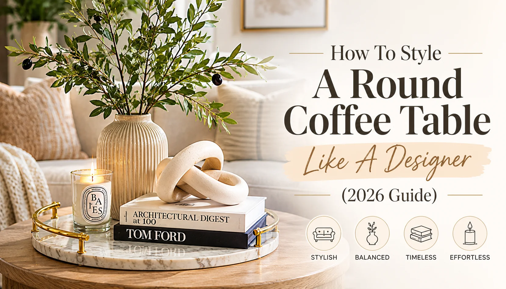
The Geometry of Round Coffee Table Styling
Styling a round coffee table presents a unique geometric challenge. Unlike rectangular tables with defined corners, a circular surface has 360-degree visibility from every seat in the room.
Interior designers solve this using the Rule of Grid inside Circle: placing a structured square or rectangular tray at the center, or grouping objects into an odd-numbered visual triangle (the Rule of Three).
5 Designer Styling Formulas
Select a formula below to view its visual breakdown and material arrangement:
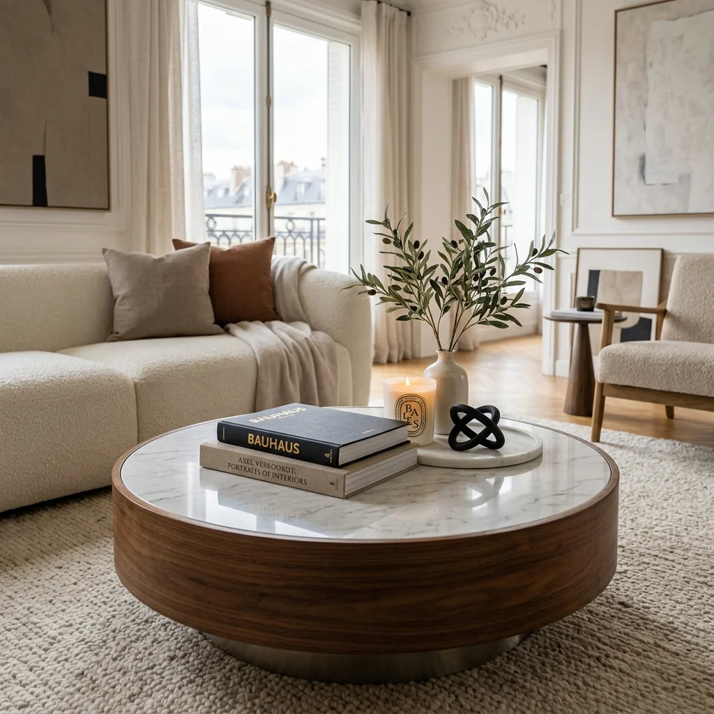
Formula 1: Quiet Luxury & Dark Elegance
Combines a heavy round marble or acacia wood tray with dark walnut hardcover books, an unlacquered brass knot, and a dimmable candle warmer glow.
Key Elements
Honed Marble Tray + Hardcover Art Volumes + Brass Object + Dimmable Candle Lamp.
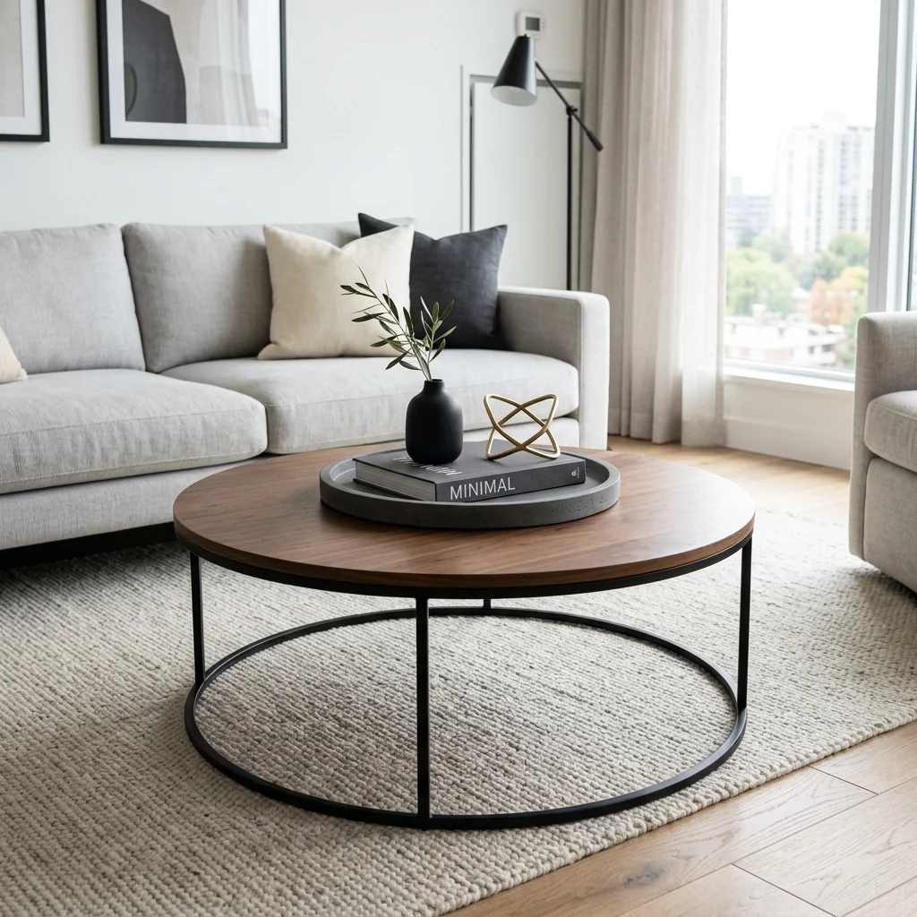
Formula 2: Modern Minimalist Restraint
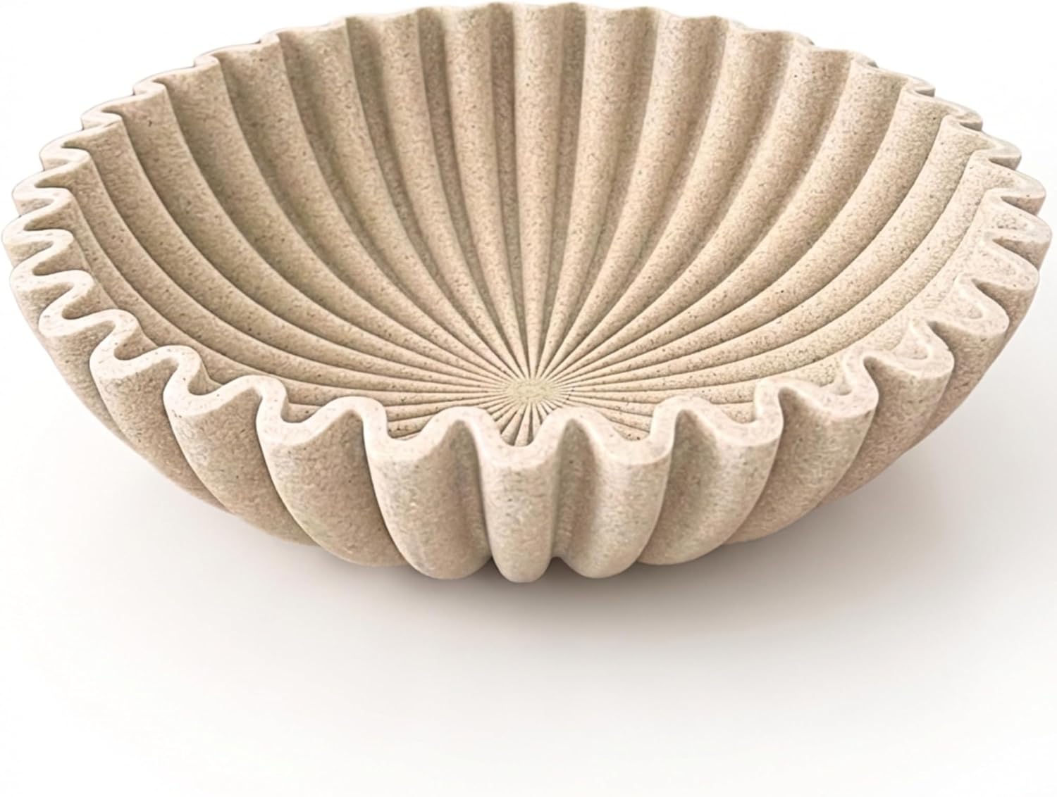
Focuses on maximum negative space (50%). Uses a single low footed marble bowl paired with a tall matte ceramic vase holding fresh olive branches.
Key Elements
Footed Marble Bowl + Tall Ceramic Vase + Organic Stems + 50% Open Surface.
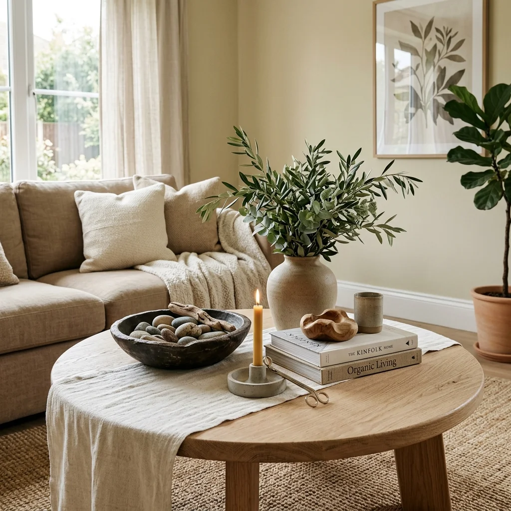
Formula 3: Organic Modern Botanicals
Introduces natural warmth using a woven rattan tray, natural linen coasters, a stoneware bowl, and tall eucalyptus foliage.
Key Elements
Rattan Tray + Faux Eucalyptus + Stoneware Candle + Natural Wood Beads.
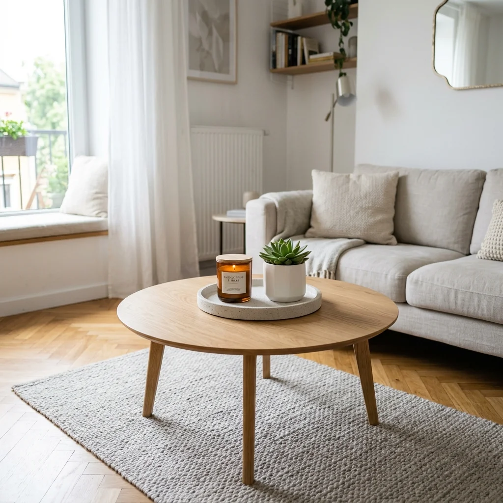
Formula 4: Renter-Friendly Compact Scale
Tailored for smaller 30-36 inch round tables. Uses a small 10-inch acacia tray with a single stacked coffee table book and a compact reed diffuser.
Key Elements
Compact Acacia Tray + Single Statement Book + Scent Layer + Zero Floor Clutter.
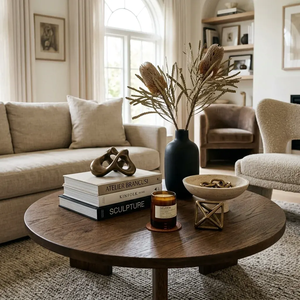
Formula 5: High-Fashion Editorial Curation
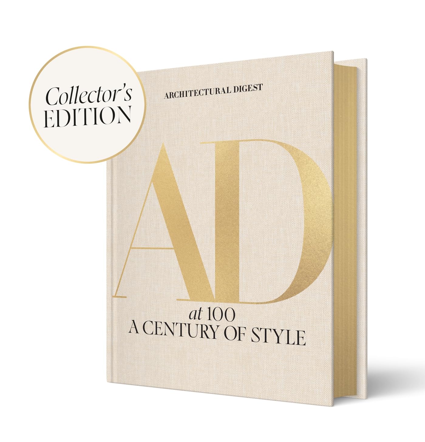
Inspired by European fashion houses. Features oversized Tom Ford / AD volumes, an abstract bronze ribbon sculpture, and a luxury Diptyque candle.
Key Elements
Oversized Fashion Hardcovers + Abstract Bronze Ribbon + Luxury Scent Candle.
The 5 Styling Principles
1. The Anchor Tray (Rule of Grid)
Trays instantly contain visual clutter. A round table styled without a tray often feels scattered; placing a rectangular or square marble tray creates a grounding visual anchor.
2. Triangulation of Heights
Never place items of the same height next to each other. Vary vertical scale across three tiers: High (vase/branches), Medium (candle/sculpture), and Low (stacked books/tray surface).
3. The 40-30-30 Negative Space Ratio
Reserve 40% of the surface for functional open space (placing coffee cups, glasses, or books). 30% for the primary anchor (tray or book stack), and 30% for accent objects.
4. Tactile Material Contrast
Mix at least three contrasting textures: matte stone against polished brass, smooth glass against natural linen or wood grain.
5. The Rule of Odd Numbers
Group items in clusters of 3 or 5. Odd-numbered arrangements force the eye to move around the table, creating continuous visual interest.
5 Mistakes That Make Coffee Tables Look Cheap
The Overcrowded Flat Surface
Covering more than 70% of the table surface with small trinkets creates chaotic visual noise.
Single-Height Monotony
Placing objects that are all 3–5 inches tall creates a flat, lifeless plane.
Ignoring Surrounding Seating Scale
Using a tiny 8-inch tray on a large 48-inch table looks disproportionate and weak.
High-Gloss Polyurethane & Cheap Plastics
Plastic fake flowers and high-gloss plastic trays look cheap under residential lighting.
Zero Living or Organic Texture
A table composed entirely of books and metal objects can feel sterile and unlived-in.
Shop The Look: 20 Designer Accessories
Explore 20 hand-selected Quiet Luxury accessories tested for scale, texture, and aesthetic impact: